A Vietnamese cosmetics brand.
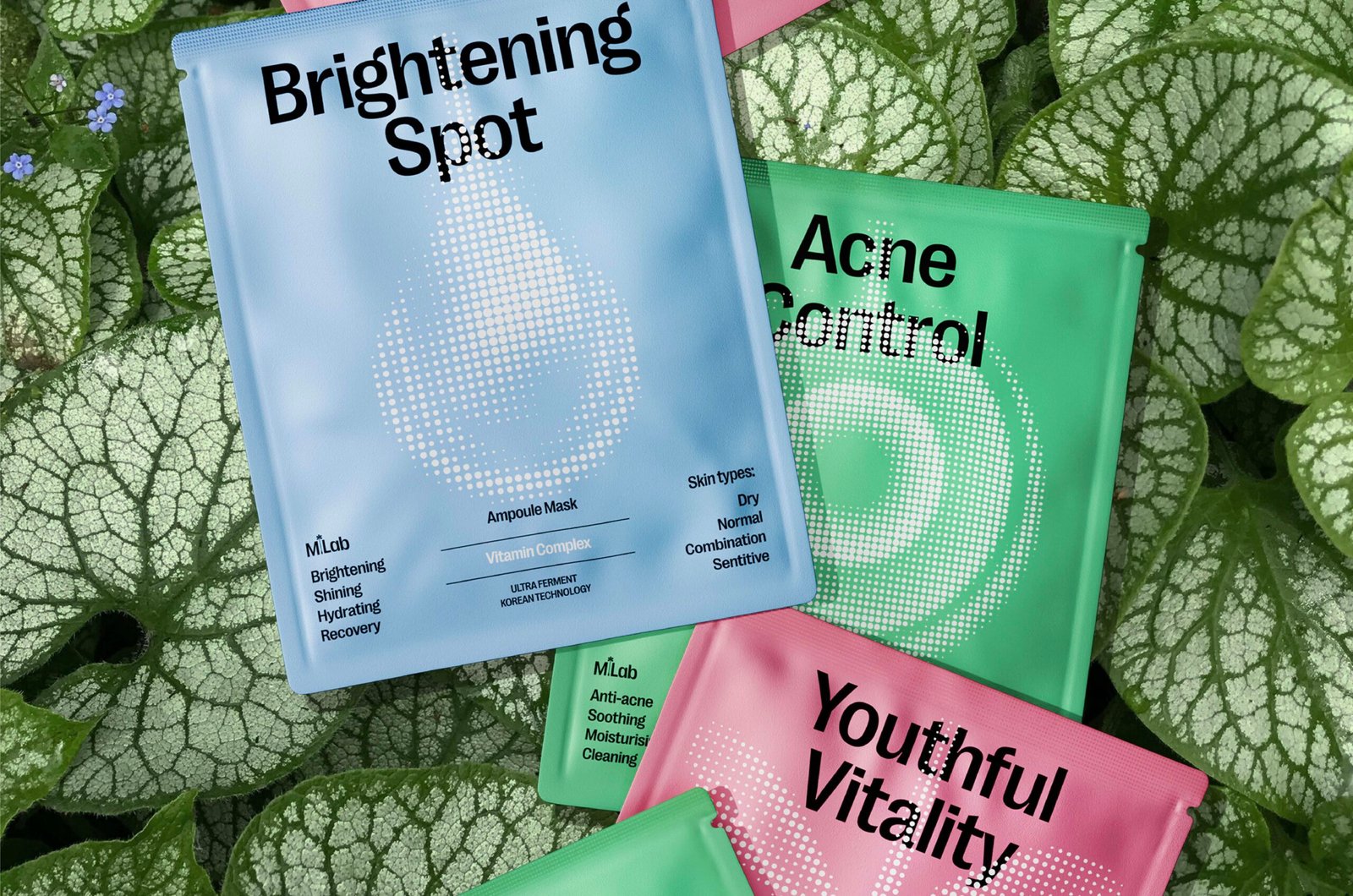
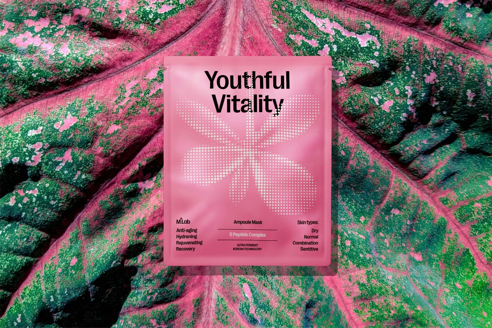
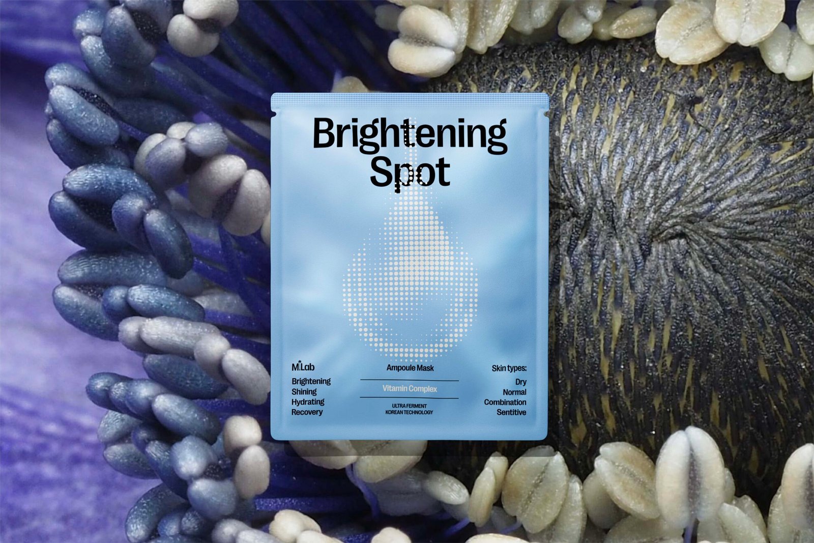
In its previous iteration, MLab was known for its highly reliable products, practical effectiveness in the beauty industry, and accessible pricing. Upon its return, M*Lab aimed to strengthen its unique positioning as a brand that skillfully combines new Scientific advances with the enduring power of Nature, visually communicating the value of unlocking inherent beauty through distinctive identity system and packaging.
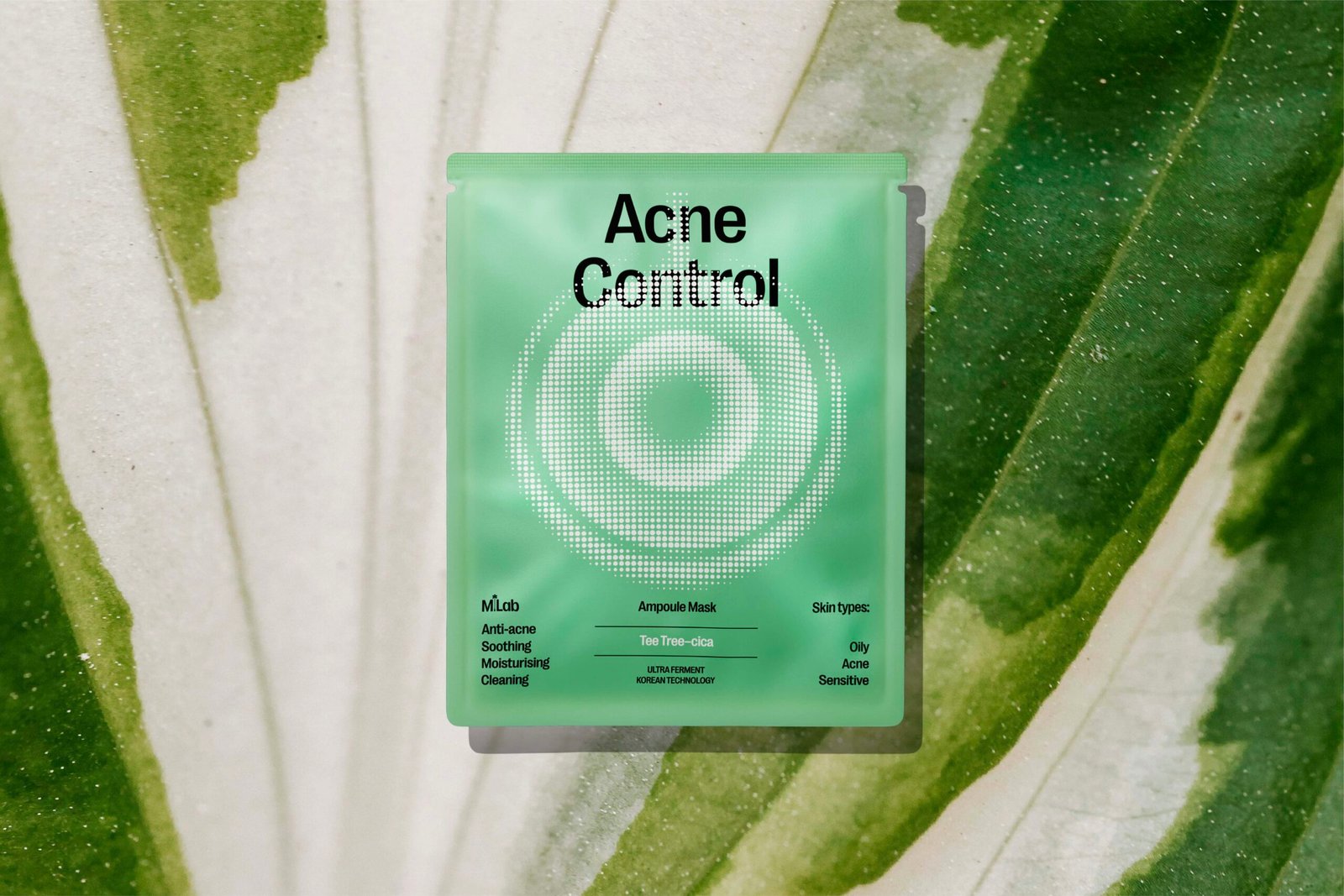
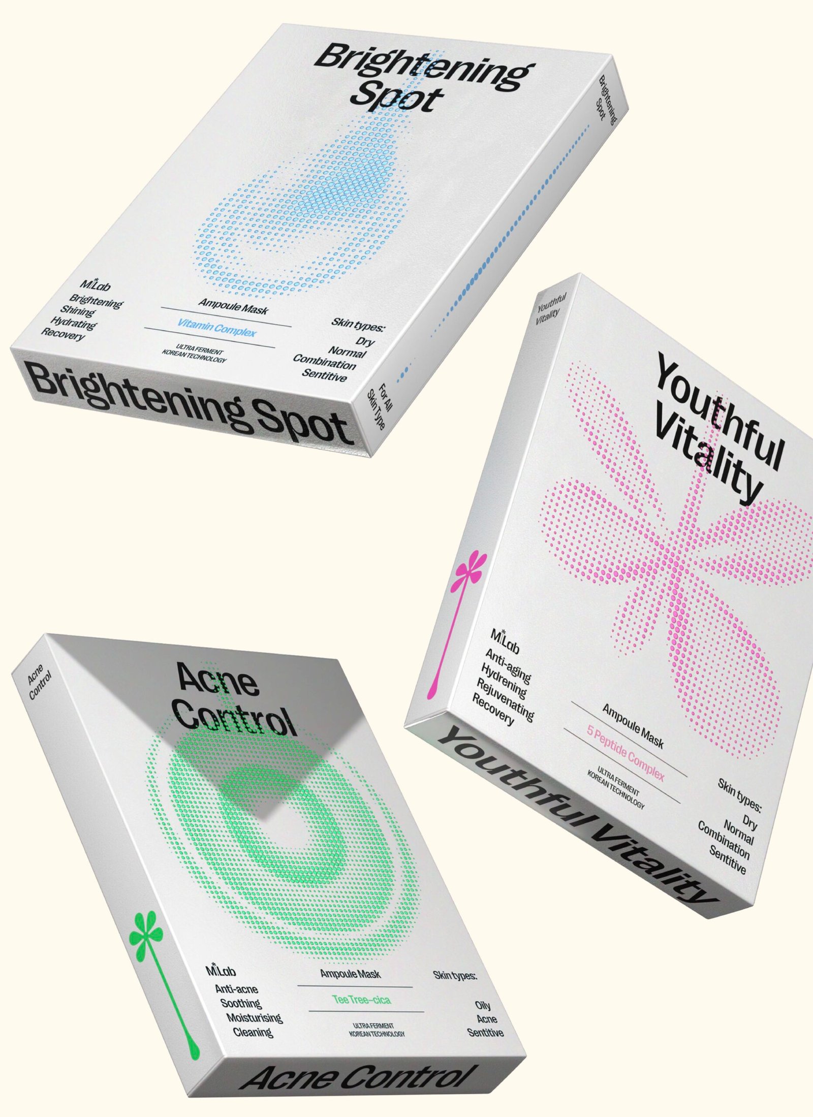
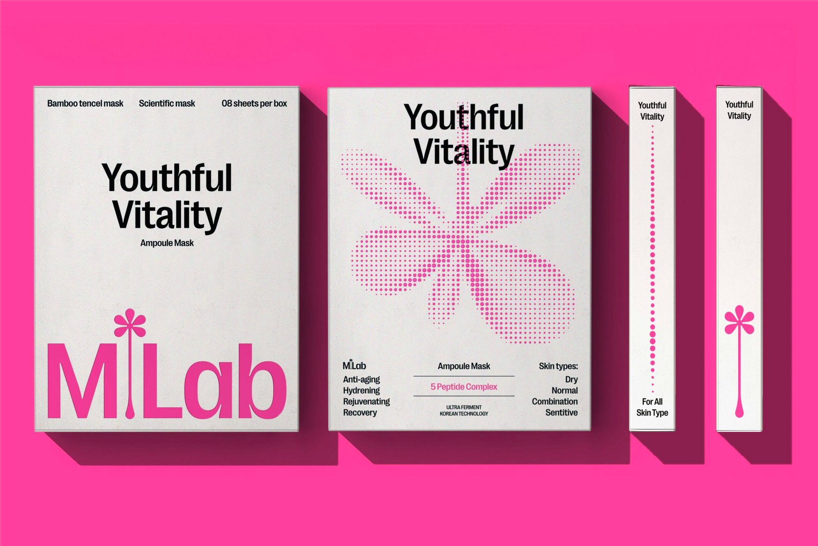
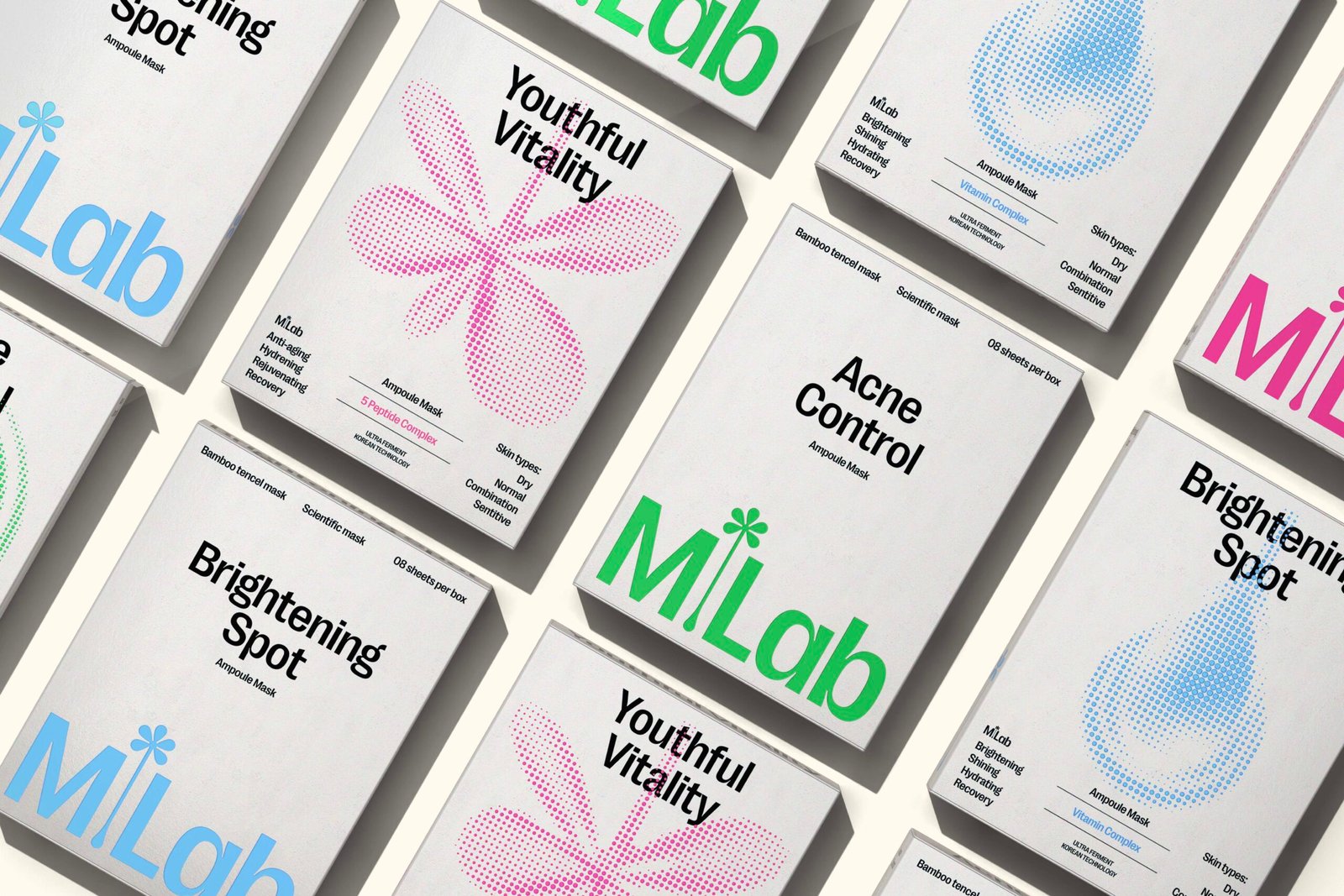
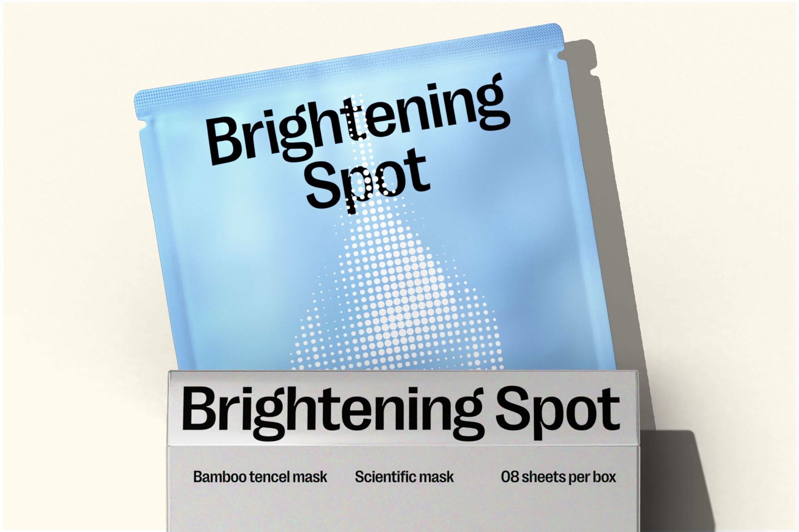
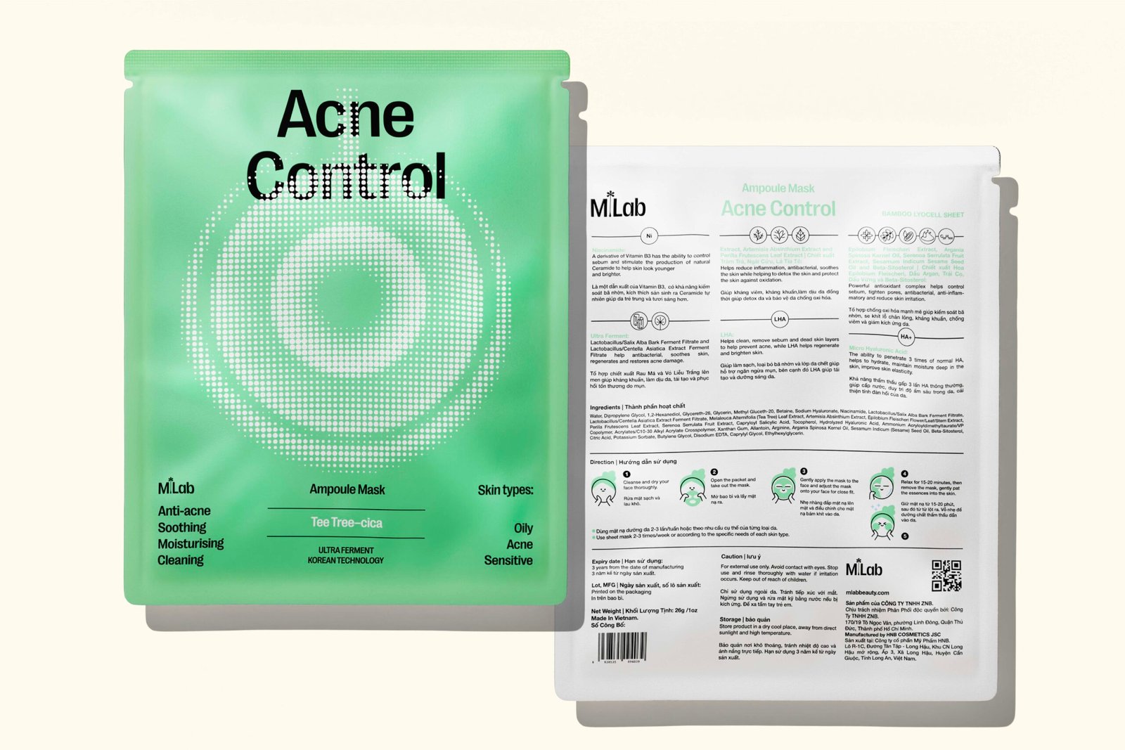
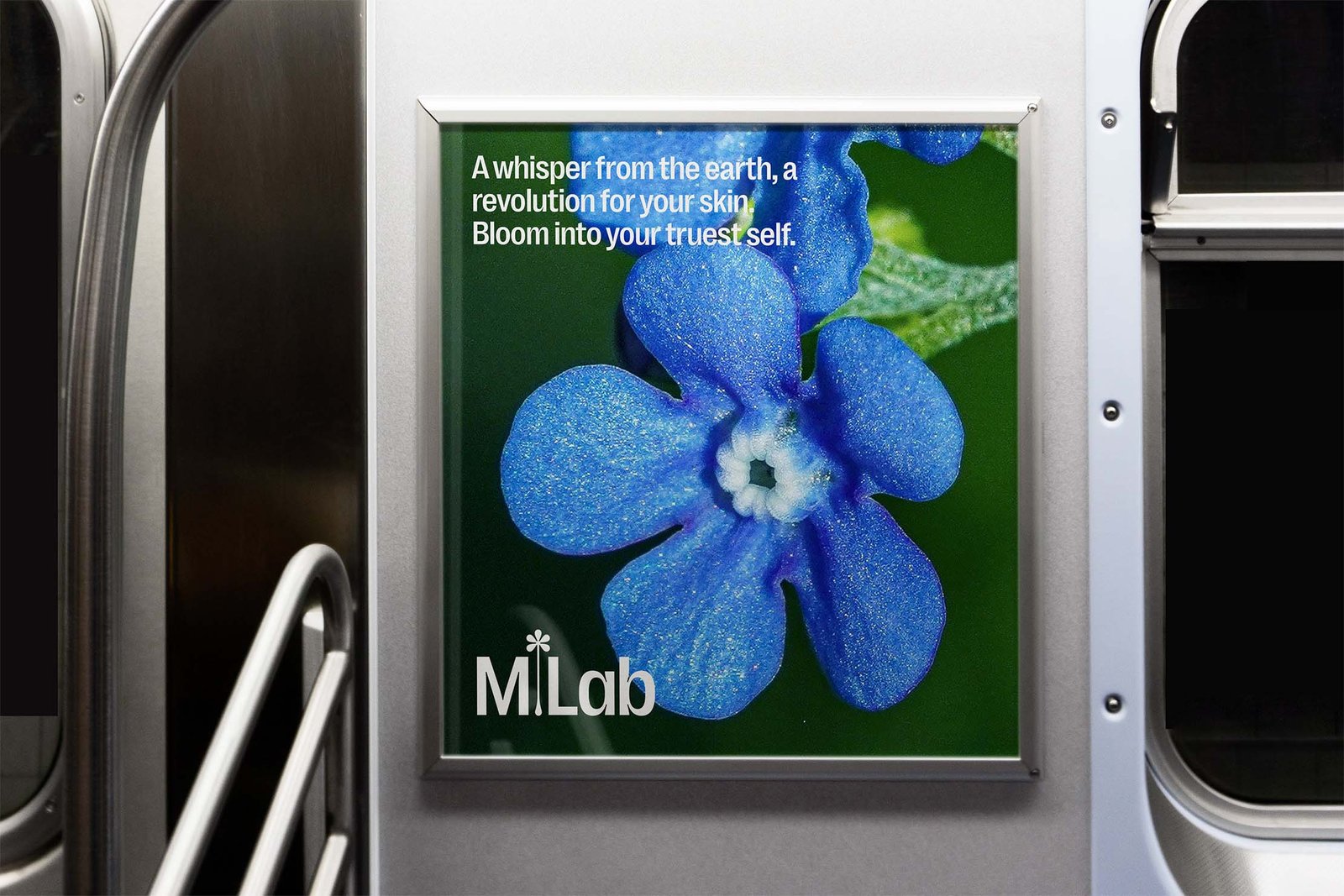
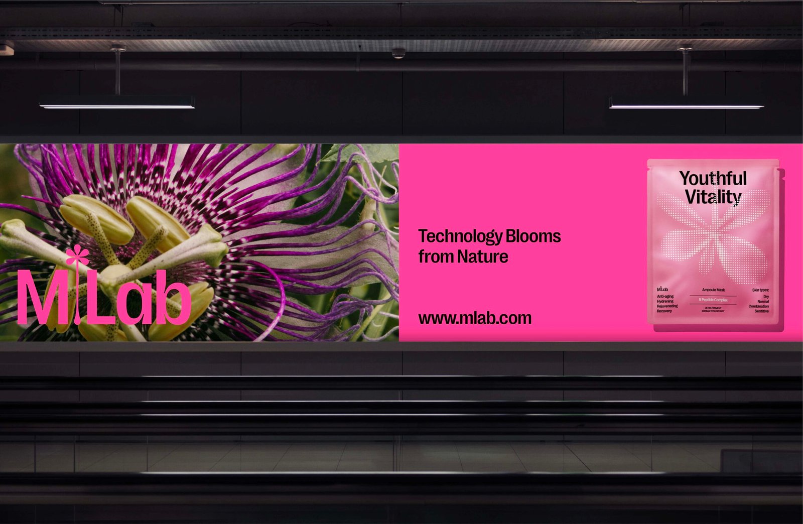
To tell this story, we explored the grand concept from nature’s miraculous power, specifically the fundamental cellular structures that form the foundation of all beauty. The identity system employs minimalism and strategic whitespace to honor natural beauty through visual image from nature.
Alongside this, the logo was designed using the Right Grotesk typeface, stylized with an asterisk, symbolising the process of innovation – the technological transformation of natural elements into refined products.
The color palette was also inspired by nature with countless options for future product lines, but with youthful pink representing beauty, vitality, and inspiring consumers. The overall simplicity of the identity system has contributed to creating a flexible foundation for the brand’s future development.