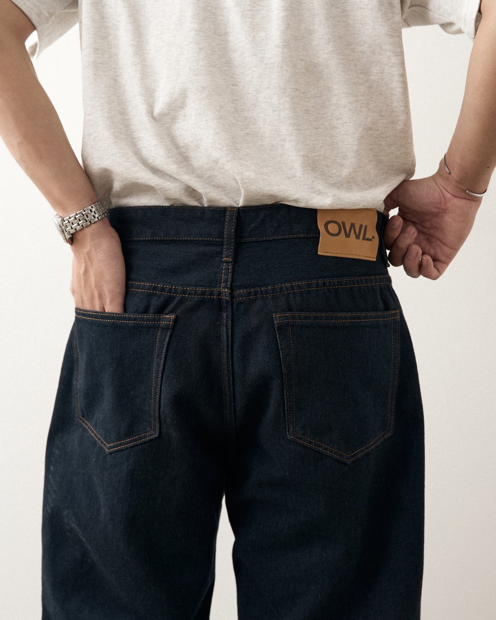
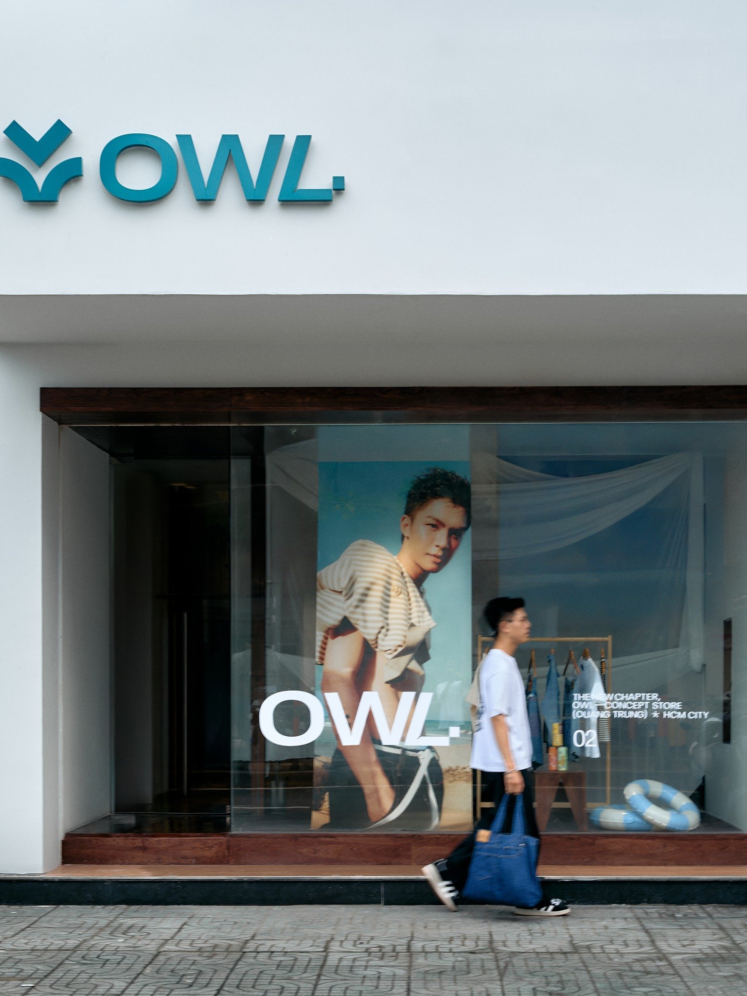
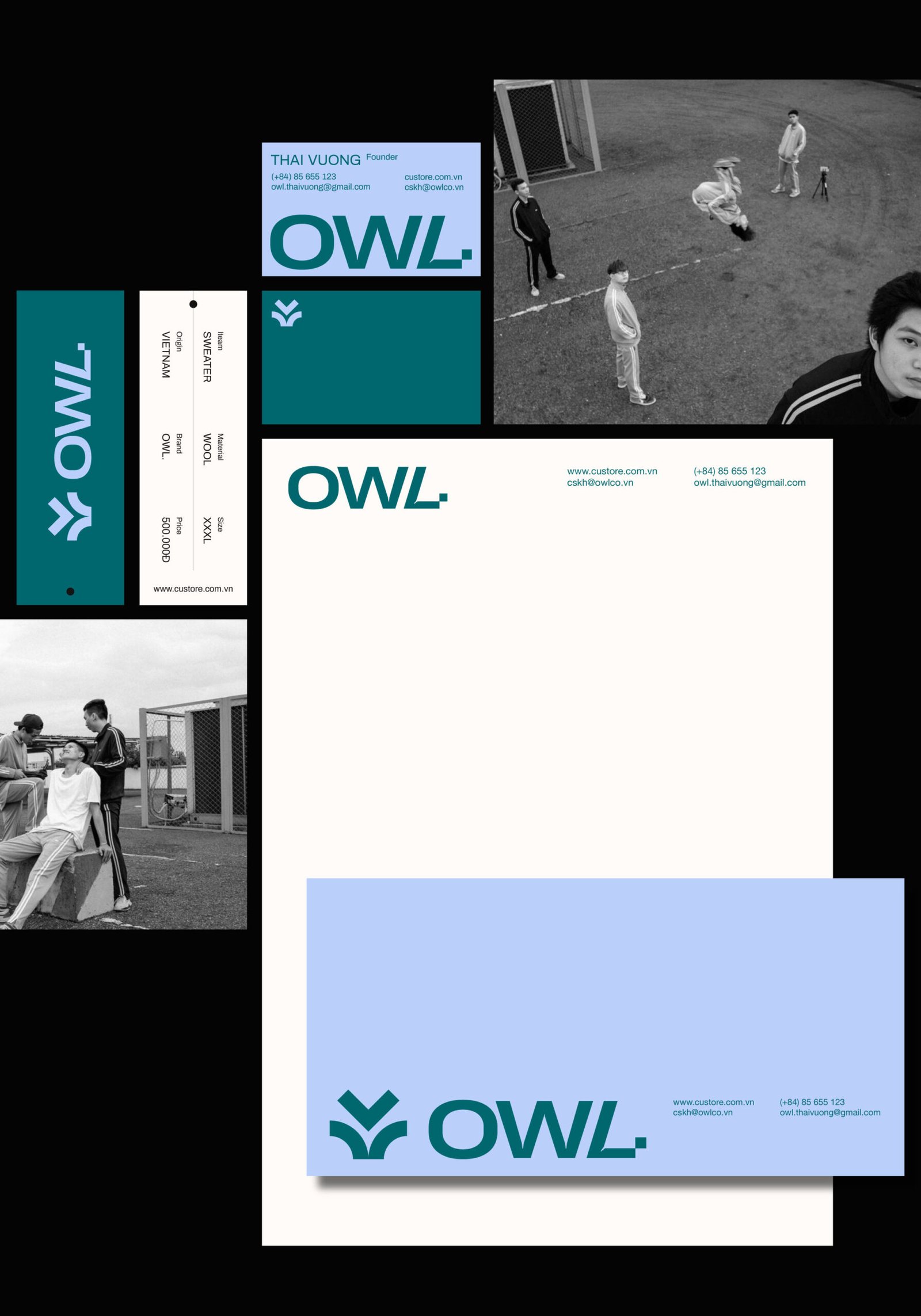
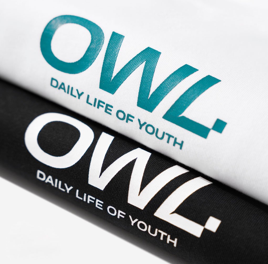
The brand’s logo inspired by the image of an owl – signifies intelligence and sophistication, representing young people who are on the way to finding and asserting themselves. The logotype of OWL. gives a modern and soft brand image by using the Sans serif font slightly “a brand that makes the attitude and confidence of people who want to be themself” to easily remove the negative elements in daily life. Together the whole logo creates modern, young but still minimal for the brand appears to be able to reach diverse youth.
OWL. uses the Heading Pro Wide font that gives a modern and soft feeling to express a similar impression to the logo with customized shapes. In addition, it also uses Archivo to build a flexible font use for any kind of brand’s product.