The brand’s logo is inspired by the product’s 100% natural ingredients and the care and attention in each stage of product finishing. The font chosen for the Logo carries the spirit of innovation, fun, and dynamic, along with that, the forms of the characters are customed to evoke naturalness, true to the brand’s values.
In addition, the tray image is included in the logo below the letter “b” to remind the Fatbroccoli category and make the brand name easier to read, as well as honour the health of the product by highlighting the phrase “broccoli”.
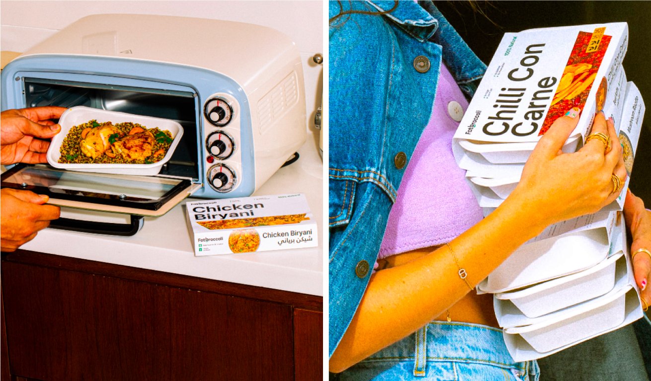
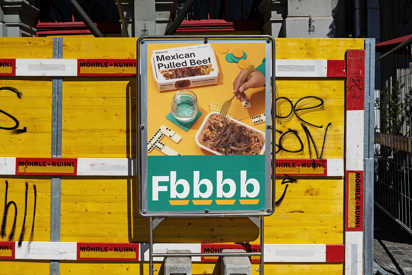
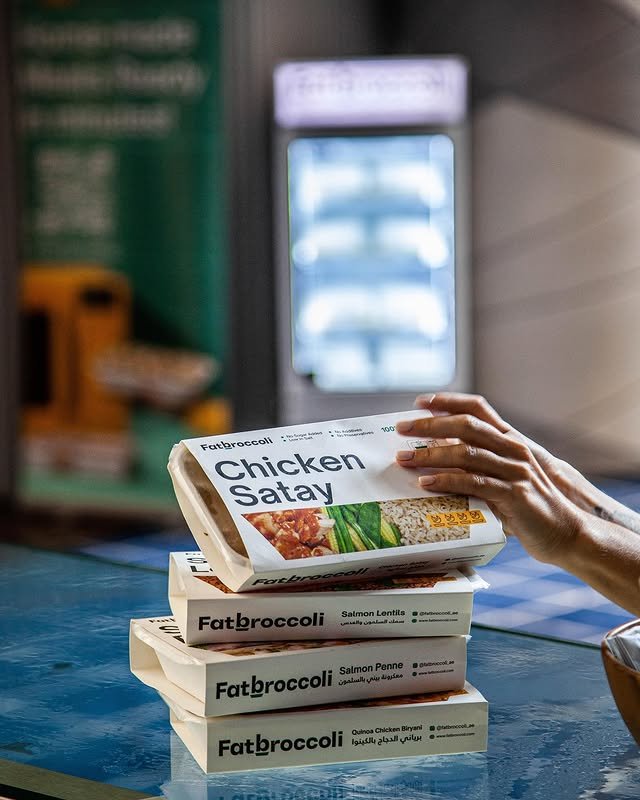
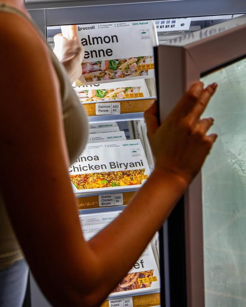
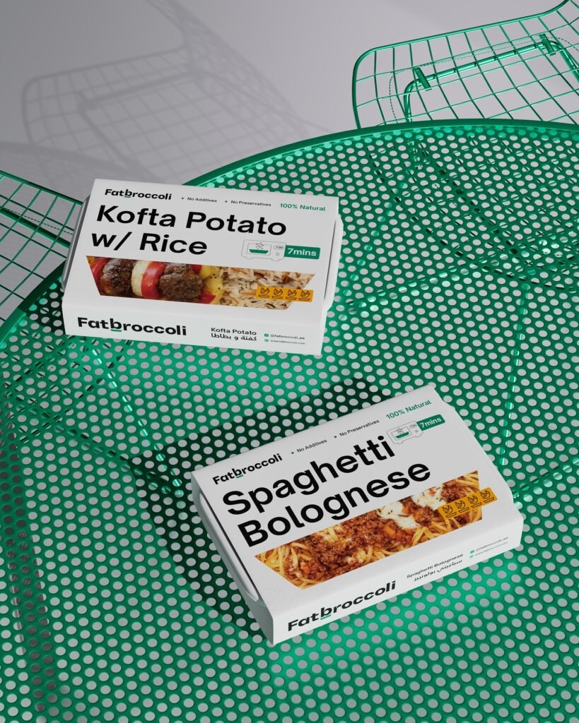
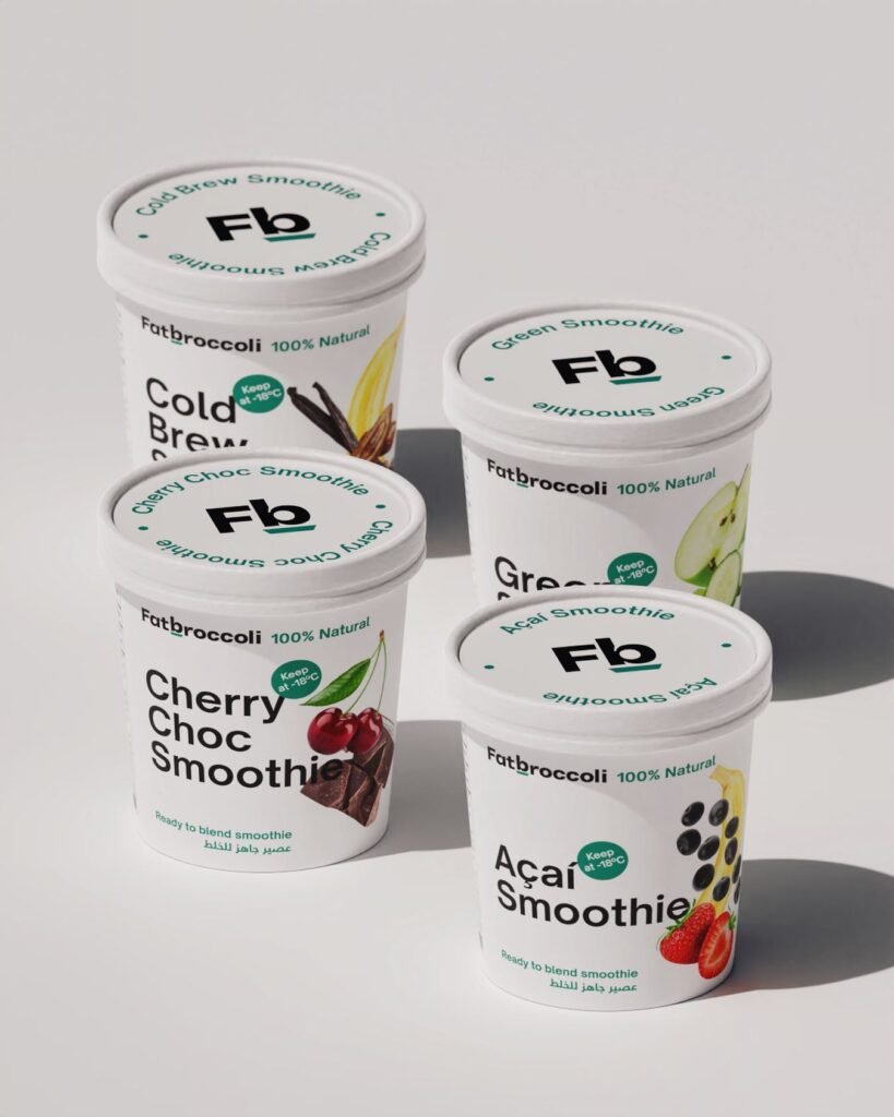
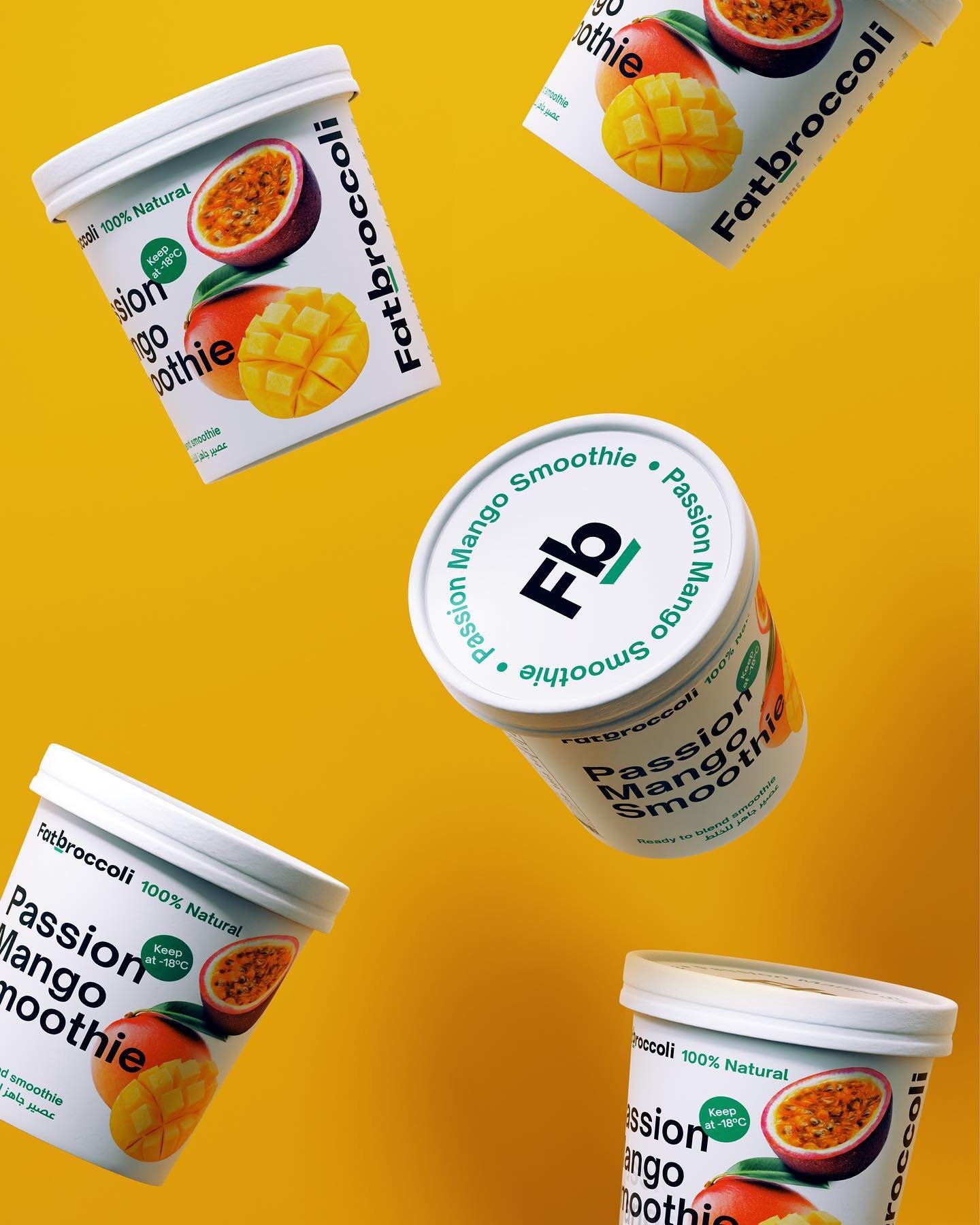
Fatbroccoli’s products with the characteristics of frozen food throughout as well as having to be regularly shipped around the world, we have created a packaging design with a simple structure that is highly effective in brand recognition. With the simple text and image layout system, Fatbroccoli’s packaging can adapt to many flavours quickly and effectively.
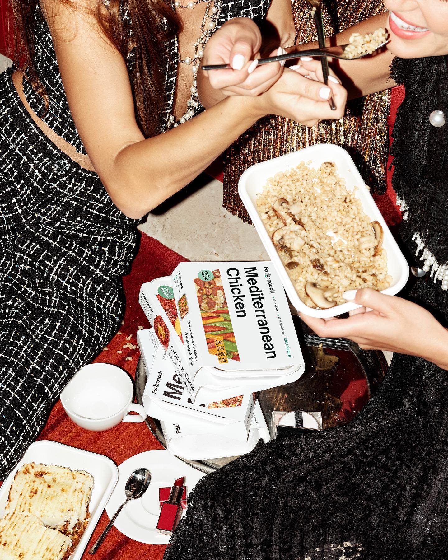
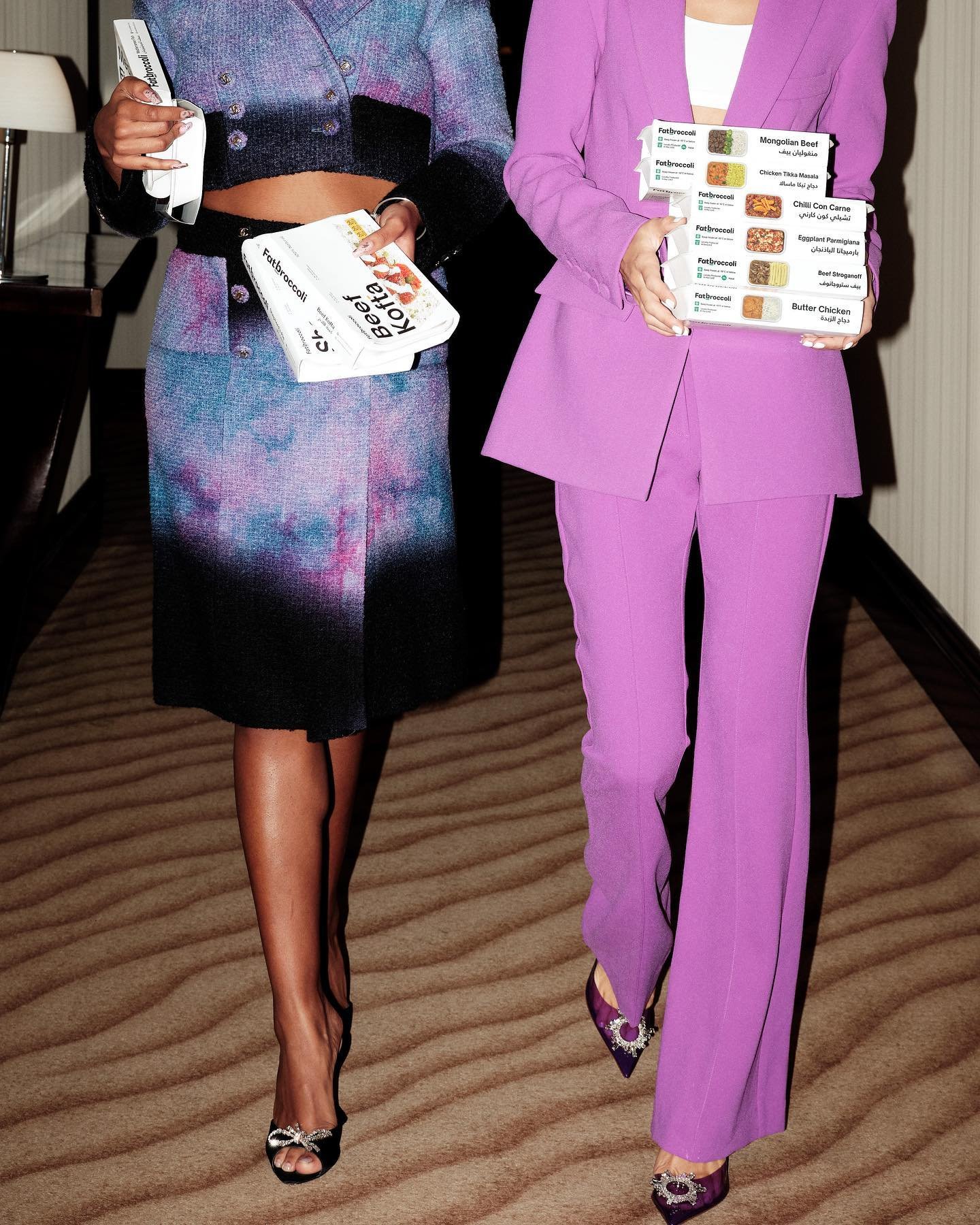
With an audience aimed at the modern and busy young generation, the brand identity system is designed in a modern, dynamic, clean and impressive way. The overall story is “We bring dishes from all over the world to your home door”, we created a sticker system inspired by stamp images and signature ingredients from different nations to evoke a convenient and universal character—product demand.